 |
| Diagonal Stripes OTN |
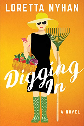
And I'm still reading Digging In by Loretta Nyhan. The blanket is progressing much faster than the reading.
But the real point of this post is to ask your opinion about a couple of things.
Would you rather the blog's text and photos look like the above,
 |
| Digging In |
or like this? Which looks better on your screen? Does the smaller text cause eye strain? Is the larger text so large it sort of jumps off the screen and scares you? Does the size make a difference on your phone? And the photos - are they too large and in your face, or are they too small to see? (Which actually, with my photography skills, may be a good thing!)
So please, let me know what you think. Small or large text? Small or large photos? Which do you vote for?
And while you're voting, join me for today's #Unraveled link up.

I like the bigger text as apparently my reading skills have deteriorated quickly, but the smaller text does not cause eye strain. I am loving the balnket, so beautiful.
ReplyDeleteWhat Meredith said.
ReplyDeleteI love your striped blanket!
bigger text is better for older eyes. I can read both :) lovely knitting!!
ReplyDeleteDitto all of the above-- bigger text, older eyes, lovely blanket!! I read blogs only on my laptop, so it doesn't have to fit onto a phone-sized screen for me... (and yes, I can read both sizes of text)
ReplyDeleteEither text is fine. There is a significant difference on my PC, but on my iPhone, the difference in text size is nominal. Photos are the same size on my iPhone, but as far as viewing them on the PC - I can click on the image and view it larger. :)
ReplyDeleteSo, I was not much help? And, I am with Mary, that knitting is gorgeous - large or small! XO
My only opinion is.....that blanket is gorgeous!!! I love the colors. There, does that help? LOL
ReplyDeleteKnitting those great stripes in the sun looks just wonderful! My votes are probably for larger text and larger photos, but the small actually looks good, too. Large does look big and bold on my PC, but there really isn't much difference between them on my Kindle Fire. So really, either one!
ReplyDeleteI agree with what the others have said. I think the larger typeface is more "fresh" and light-hearted (from a design sense). It makes your blog post look more . . . friendly and fun. (And the blanket is really wonderful. You're making such great progress!) :-)
ReplyDeleteI like larger type, which may have something to do with age???
ReplyDeleteI think you could vary the photos, based on how important detail is.
Larger text is better, view only on tablet.
ReplyDeleteYes, larger text. Somehow blogger's default is (has become) very small. On my own blog I just went up a pixel size too, considering going even bigger since the difference is not very visible yet.
ReplyDeleteYour pictures are great, so you could make them larger, but I usually click on them if I want to see more.
That books sounds like a wonderful story. Can't find it on Kobo though. I will have to find out if Kindle books work on my e-reader...